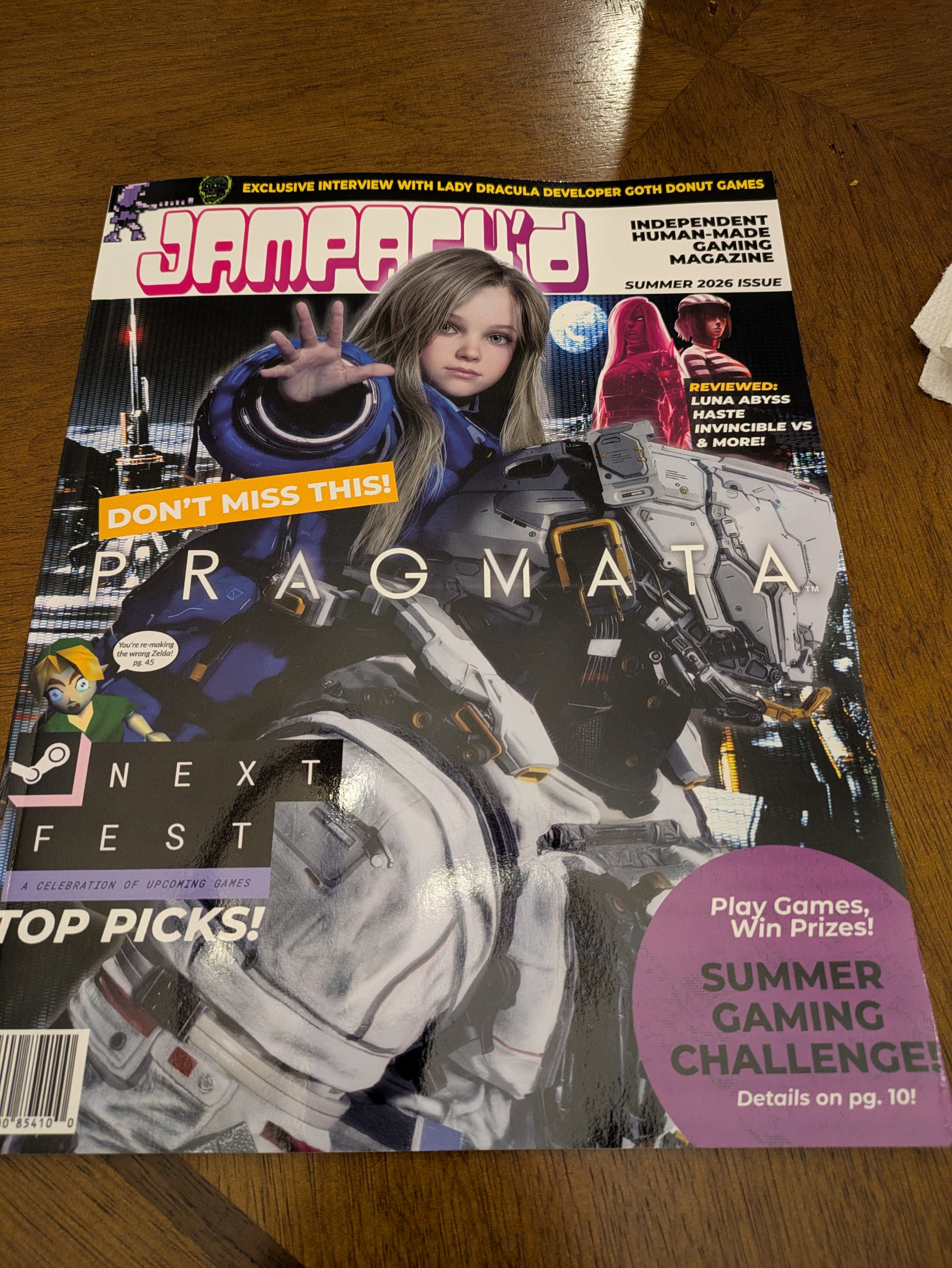
Alright, you asked for everything so I took notes on everything that popped into my head during my reading sessions.
I have education & work experience in digital & print design, so these notes are written in a relatively blunt, straight-to-the-point way that is predominant in the critique-culture of those spaces. I’m not writing these notes in an attempt to discourage, discredit or put down your work— instead I am writing them from a place of (relative) objectiveness that gets to the point regarding points-of-friction & curiosity/questions I may have. (I also wrote a bit more regarding the design because of my background, so apologies on the brevity of the written content notes.) I folded everything into drop downs so that it wouldn’t be a large wall of text, know that can be pretty daunting personally.
Ultimately, I thoroughly enjoyed the Zine! It was incredibly fun to flip through, stumble across the inserts, feel the smooth glossy paper in my hands, and observe the visual and written content over a handful of reading sessions. I look forward to engaging with some of the call-to-action sections for the audience (I so look forward to that pin) as well as what comes next for JAMPACK’D Issue 2!
Design Notes:
Color contrast & legibility issues with text
The opening, inside cover page has a really cool image of some graffiti with an overlayed opaque white layer with text laid on top. While it is a recognition of & attempt to ease some legibility concerns, it does remain hard to read on my eyes. Here is a great tool I used in my work to help check color contrast in the scope of accessibility compliance. I wouldn’t stress all too much about making sure it hits any level of compliance, but the contrast ratio tool could be helpful in sorting out issues such as these. You could also consider a gradient fade from image to white, and anchor the text to the bottom of the layout to ease this pain point by reducing the shift in color (and thus, contrast) as the text spans across the many different shades of colors. There’s a handful of instances as well with page graphics that, while stylistically I am a big fan of, also can be lumped into this bucket of contrast & readability concerns. The areas where you set a tight drop shadow on the text, such as pages 34 & 35, do a solid great job negating this issue, though.
Page gutters
There’s a handful of instances where screenshots get sucked up into the gutter in awkward ways. Page 4 & 5 for example seem to have the “action” of the screenshot fall into the gutter. Even ate some text on page 22, potentially printing issues though?
Love the colored sections for quick skim navigation
Love the color coded headers for the Steam Next Fest, and a couple of the following section as a way to show the overarching connection in a quick, visual way. I always appreciated these types of methods of quick visual communication, making it easy to jump back and fourth between sections. It does take a hefty amount of space, so I understand why it’s not done on every spread. Wonder if there is other methods or achieving a similar effect.
Margins feel tight
I personally found the margins, both between print edge and content, and between content and content, a little tight. To me, it brings this cramped feeling to the spreads. I would consider increasing them by 50% or 100%, and compensate by adjusting type size down.
Jumping between left & justified alignments
I initially noticed it on The Newz page (but later noticed you use it elsewhere) that you used justified type, presumably as a nod to traditional/historical printing methods. I really like the idea here, but I think your type size is a bit too large in relation to some of your column sizes. There are some lines that have incredibly large spacing between words, simple fix would be to allow hyphenation on these lines (not default for inDesign if I recall) so that long words can be split across lines well, but I do think it’s worth considering type size in relation to column size. To add onto this thought though, you jump between left-aligned and justified spread-to-spread. I feel like you should stick with one or the other, and if you ask me, I think justified is the way to go. Justified type + a strong grid layout is just going to ooze that traditional print vibe (presuming you want to lean into that harder, of course.)
Copy widows
In a somewhat similar-ish vein, there are a handful of instances where you use left alignment and have a widowed (as in, left a word by it’s lonesome) word-or-two, which visually leaves a large chunk of white space (I originally wrote this note in context of the one instance of horizontal text, but there were a couple other instances in article copy as well.) Some slight manual adjustments of character spacing could help get those words onto the line above and clean up the white space there.
Image separation
In super image heavy sections, I think bringing in a margin between them would help visually separate each screenshot from one another better. In particular, page 31 has a lot of really similar colors across the screenshots that really visually blend them together.
Content Notes:
Loved some of the “games you might have missed” features
Loved the Lego Voyagers shout out, that one fell off my radar but is totally in the wheelhouse of games my fiancee and I would play together. In a similar way, I appreciate that the content is not caught up in being with all of the latest and greatest. A “games you might’ve missed” call out such as this one, along with a dedicated spread in the back half are pieces of content that I feel really aligns with what I feel like some of your Point of View regarding gaming is.
Some sections feel like they lack a PoV
On the flip side, the strictly informational News updates I felt was lacking a personal point of view. News is really fast and easy to consume, so some of the articles in this section just felt “meh” because I was already aware of them, and I felt like they didn’t really express your point of view well with them, as they appeared to be written a bit more from an objective standpoint.
Interview felt tough to read
I really enjoyed the interview section and the topics it covered, but reading it was a little rough for me. The copy was incredibly true to recording and normal conversational cadence, almost too true with the abundance of “likes” and “yeahs”. In consuming this interview audibly, the inclusions wouldn’t seem as much of a big deal. But reading them felt like hitting a speed bump, and broke up the flow for me.
Misc:
Can we bridge the gap the other direction?
We live in a digital era, undoubtedly, and it’s dismantled a lot of the previous, traditional physical mediums. While we are striving to reconnect with some of these things we’ve lost— I also don’t believe we should entirely abandon the digital experience. For, presumably many of us receiving JAMPACK’d, a bulk of our connection to the experience is rooted in a shared digital community around your content. I would love to see some sort of inclusion into tapping into that strength digital has, and include some sort of direct connection to a digital space for readers to share and discuss the issue in. Potentially a privated thread with an entry code only in JAMPACK’d? Or maybe a simple “discuss this issue” callout with a forum subsection and post on mailing to match. Just spitballing, some sort of continue the discussion call feels like it would be a good fit is mostly what I’m getting at.
That being said, I love the Games Challenge idea so much. Hope to get through it on my end!
 The backgrounds on some spreads, some of the placements of characters or game artifacts in columns, and incredibly stylized headings all feel like decisions made from a personal aesthetics choice that I really love and continue to crave moving forward. If you’re using Affinity Publisher, consider building out some Master Pages and Paragraph Styles of your own that give you a consistent jumping off point to build within a consistent rule set, as well as an intentionality for when you break these rules (which really helps when establishing a visual hierarchy for the specific element within the spread.)